Vaguard Basic Font: Adding Vintage Strength to Web Layouts
I was staring at a hero section for a new artisanal leather goods client, and something felt off. The layout was clean, the photography was moody and textured, but the typography lacked grit. I had tried several modern sans serifs, but they felt too sterile for a brand rooted in heritage craftsmanship. That is when I loaded Vaguard Basic into my design file. Instantly, the headline gained the masculine, industrial weight the project desperately needed without sacrificing digital clarity.
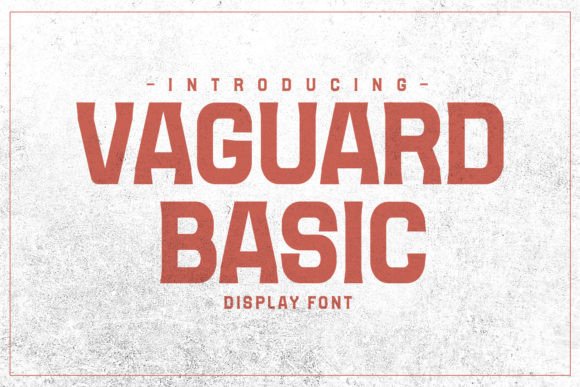
As web designers and UI creators, we often hunt for that elusive sweet spot where vintage character meets modern usability. Vaguard Basic sits comfortably in this niche. It is an industrial display typeface that carries a classic vintage touch while remaining legible on high-resolution screens. In my recent project testing, this font proved to be more than just a decorative element; it became a functional tool for establishing visual hierarchy and brand trust on a product landing page.
Testing Industrial Typography in a Digital Hero Section
The first real test for any display font is the hero banner. On desktop, you have plenty of horizontal space, but mobile screens demand vertical efficiency. I set the main headline in Vaguard Basic at a large scale against a dark, textured background. The letterforms are bold and structured, which helped them hold their shape even when overlaid on complex imagery. Unlike some script fonts or overly ornate vintage typefaces that dissolve into noise against busy photos, Vaguard Basic maintained crisp edges.
What stood out during this layout phase was the font’s inherent personality. It communicates durability and timelessness. For a boutique online store or a coaching website focused on resilience and strength, this typeface does heavy lifting before the user even reads the copy. It signals quality through form. However, I quickly learned that its strength is also its constraint. This is not a font for long-form reading. It demands space and brevity. Using it for subheadings required careful tracking adjustments to ensure it didn't feel too dense on smaller viewports.
Balancing Readability and Brand Mood
Readability in web design is non-negotiable, but mood is what converts. When integrating Vaguard Basic into a responsive layout, I had to be intentional about contrast. Because the strokes are thick and industrial, using this font in light gray on a white background caused accessibility issues. Switching to high-contrast combinations—like charcoal text on cream or white text on deep navy—restored legibility immediately.
I also paid close attention to line height. Display fonts with a vintage structure often have tighter vertical metrics than modern web-safe fonts. Increasing the line-height slightly prevented the letters from feeling cramped in multi-line headlines. This small adjustment made the difference between a layout that felt claustrophobic and one that felt premium and breathable. For digital product creators building course sales pages or portfolio sites, these micro-typographic decisions directly impact how professional the final build feels.
Strategic Font Pairing for Modern Interfaces
Vaguard Basic has a distinct voice, which means your supporting typography needs to know when to listen. During the mockup phase, I experimented with various pairings to find the right balance for body copy and UI elements.
- Geometric Sans Serif: Pairing Vaguard Basic with a clean geometric sans serif (like Montserrat or Inter) created a striking modern-vintage contrast. The simplicity of the body text allowed the industrial headers to pop without competing for attention.
- Neutral Serif: For a more editorial or blog-heavy site, a neutral serif font added a layer of sophistication. This combination worked exceptionally well for a digital brand kit, bridging the gap between rugged masculinity and refined storytelling.
- Monospace: For technical portfolios or SaaS founders wanting a raw, utilitarian aesthetic, a monospace font complemented the industrial vibe of Vaguard Basic perfectly, reinforcing a "blueprint" or "spec sheet" visual language.
Avoid pairing this typeface with other highly stylized display fonts or handwritten scripts. The result is usually visual chaos. Let Vaguard Basic be the protagonist of your typographic story, and choose supporting actors that enhance rather than distract.
Application Across Digital Touchpoints
Beyond the main website header, I found Vaguard Basic incredibly versatile for specific digital assets. On a product label mockup for the e-commerce site, it provided the necessary shelf presence even in thumbnail size. For social media graphics and digital ads, the bold letterforms ensured the message was readable during rapid scrolling. The font’s masculine style translates particularly well to call-to-action buttons when used sparingly. A short, punchy phrase like "SHOP COLLECTION" or "START NOW" in Vaguard Basic carries significantly more visual weight than a standard system font, potentially improving engagement through sheer aesthetic confidence.
However, I avoided using it for navigation menus or footer links. The intricate details of industrial typefaces can become muddy at small sizes, especially on lower-resolution mobile devices. Sticking to simple sans serifs for functional UI elements preserved the user experience while reserving Vaguard Basic for moments of high impact.
Technical Considerations for Web Implementation
Before committing to Vaguard Basic for a live client project, practical due diligence is essential. As a premium display font, checking the licensing terms is the first step. Ensure the license covers web embedding, digital ads, and any merchandise or packaging design if your project spans physical and digital realms. Commercial font licensing varies, and assuming a desktop license includes webfont usage is a common pitfall.
Performance matters as much as aesthetics. When exporting webfonts, I always subset the character set to include only the necessary glyphs. This reduces file size and improves load times, which is critical for SEO and user retention. Check if the font package includes multiple weights. Having access to a lighter weight can be useful for secondary headings or larger subtext, providing flexibility within the same type family. Also, verify multilingual support if you are designing for international audiences; nothing breaks a polished brand identity faster than missing accented characters falling back to a default system font.
Finally, test extensively across browsers and devices. What looks sharp in Figma might render differently in Safari or Chrome due to anti-aliasing differences. I recommend implementing CSS font-smoothing properties to optimize rendering on macOS and ensuring fallback stacks are visually similar enough to prevent jarring layout shifts during loading.
Incorporating Vaguard Basic into a digital project is an exercise in restraint and emphasis. It is a powerful tool for web designers and entrepreneurs who want to infuse their online presence with industrial charm and vintage authenticity. By respecting its readability limits, pairing it thoughtfully, and handling the technical implementation with care, this typeface can elevate a standard layout into a memorable brand experience. It reminds us that in digital design, typography is not just about reading words—it is about feeling the brand.